Innovating through Design Sprints
EDI Students Partner with Kraft Heinz, Lurie Children’s, and Actualize Therapy
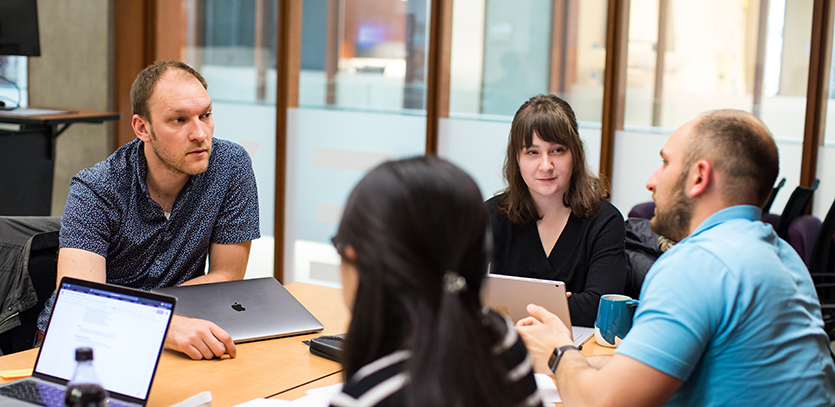
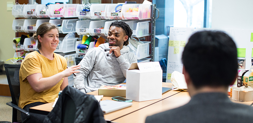
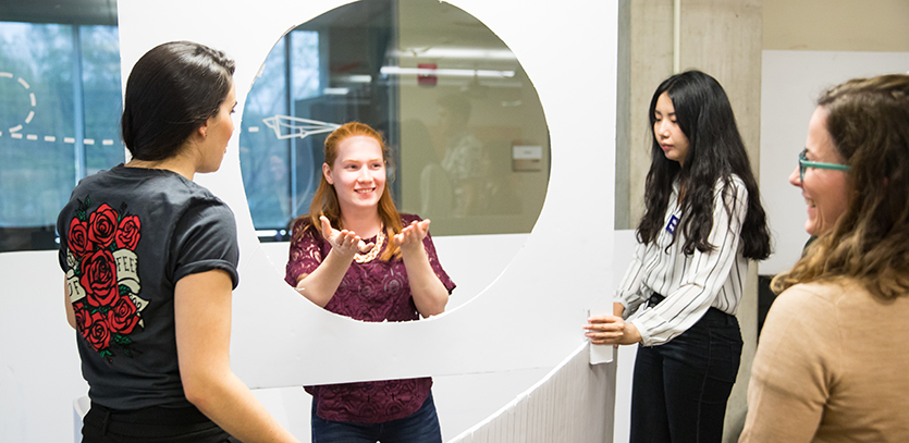
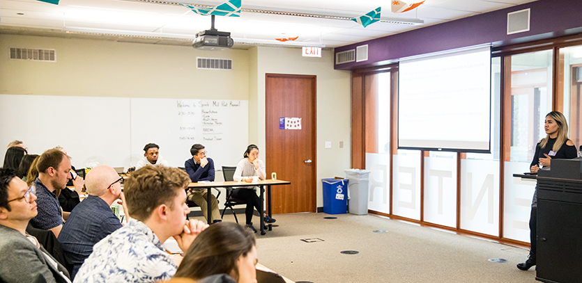
This spring term, fourteen students from Master of Science in Engineering Design Innovation Program (EDI) were enrolled in Design Sprints, an elective combining coursework from EDI's Program Director Jim Wicks' Management of Product Innovation curriculum with human-centered design projects for industry partners. The course was co-taught by Amy O'Keefe, EDI's Studio Director.
Students were matched with one of three industry partners: Kraft Heinz, Ann & Robert H. Lurie Children's Hospital of Chicago, and Actualize Therapy. The projects focused on areas of product, interaction, or service, respectively:
- Kraft Heinz challenged students to redesign a consumer packaged food to help customers minimize waste in frozen meals and savory foods
- Actualize Therapy asked students to focus on UI/UX design for mobile and web-based mental health interventions
- Lurie Children's asked students to redesign the welcome experience in their reception area
Representatives from the industry partners visited Northwestern's Evanston campus to hear about the students' progress and to provide feedback halfway through the term. The students delivered their final presentations to Actualize Therapy and Lurie Children's on May 22 and traveled to the Kraft Heinz offices in Glenview, Illinois on May 23.
Three EDI students—Liying, Abby, and Jelani—share their perspectives on the Design Sprints course.
Lurie Children's
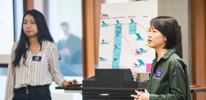
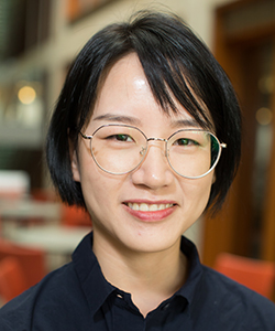
Liying Peng (EDI ‘19) and her teammate Yifei (Faye) Gong (EDI ‘19) worked together to design an express self check-in lane for outpatient families at Lurie Children's.
Q: What excited you about the challenge from Lurie Children's?
 LP: [We were challenged to redesign] the welcome experience for Lurie Children's. Faye and I both believed that an experience design project had possibilities to lead towards a solution with both tangible and digital touchpoints—which turned out to be true. We were a little nervous when we decided to work as a team on this project because we're both international students with zero experience in children's hospitals in the United States. However, we realized that our fresh perspective could be an advantage.
Q: What was your final design proposal for Lurie Children's?
LP: Our final design was an express self-check-in lane specifically for outpatient families. It included a digital self-check-in interface and a tangible self-check-in kiosk. We also integrated visual indications and additional human concierge assistant into the whole experience. It's a completely new check-in experience for Lurie. We distributed a survey to Lurie's patient family e-advisor group and the results validated that an express self-check-in lane is [something] that could catch patient families' attention.
Q: What was it like working with Lurie Children's on this project?
LP: We worked very closely with Barbara Burke, the Senior Director of Patient-Family Experience at Lurie. She provided us with valuable opportunities to interact with the concierges and the Family Advisory Board there. She gave us advice when we were designing a survey for the patient family e-advisor group. We also benefited a lot from the conversations we had with Barbara about her efforts to overcome barriers to experience improvements in the healthcare field.
Q: What was your experience conducting research, testing, and prototyping on-site at Lurie Children's?
LP: It's hard to recruit end users when working on a healthcare-related project and it became even harder when Faye and I decided on a project plan that required a new iteration of prototyping and testing every other week. [To make the most of our time with end users], we spent hours to just observing user behaviors on the second floor of Lurie. As a result, we were able to conduct prototype testing at our very first interview with the users.
Actualize Therapy
Abby Lammers (EDI ‘19) proposed a series of changes to the digital mental health apps offered by Actualize Therapy, including a new notification workflow.
Q: What excited you about the challenge from Actualize Therapy?
 AL: Actualize is working on the second version of their IntelliCare program, a modular suite of digital mental health apps backed by clinical research. They had already done a lot of work to gather and synthesize feedback on the user interface of their technology, and our prompt was open-ended—they handed us the research and we were encouraged to take those insights in any direction we wanted. I was most excited at the chance to learn new digital prototyping skills.
Q: What was your final design proposal for Actualize Therapy?
AL: One of the distinguishing features of the IntelliCare program is that each user is paired with a trained coach who provides support and guidance over the phone. The coaches have limited time with each user, and my solution focused on multiple small additions or tweaks that enhance the work the coach is doing. For example, the coach might help users build habits by encouraging them to pair app use with an existing part of their routine. I suggested that Actualize better reflect this practice in the app by designing a new notification workflow.
Q: Was there a key insight you discovered during the process?
AL: The insight that guided my work was this idea of a “building a toolbox” ethos. The coach helps remind users that mental health can be a long journey and the role of IntelliCare is to give you the skills to make progress, not to help you instantly meet your goals. I reflected this in my design by renaming the main app homepage from “Apps” to “Tools,” a simple tweak that helps the user frame IntelliCare differently.
Q: Was there a skill from your EDI coursework that you especially leaned on during this design sprint?
AL: This project highlighted the benefits of scoping a project down and taking a strong point of view. When you approach a narrow slice of the app system with a clear design direction, it is much easier to brainstorm and justify your final design. Even if the features I designed never make it into the app, I hope that my point of view and design principles can spark other ideas at Actualize.
Kraft Heinz
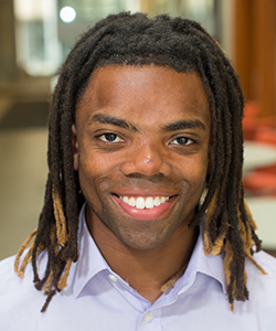
Jelani Roberts (EDI ‘19) and his teammate Hanna Lauterbach (EDI ‘19) designed a system of pre-portioned frozen foods to reduce food waste throughout the meal prep process.
 Q: What excited you about the challenge from Kraft Heinz?
JR: I was excited for the opportunity to design in the food space. Food is something everyone can relate to and something that everybody has strong opinions on, so that made it exciting to talk to prospective users. Food—from production to waste—is also an area that plays a really big role in sustainability and it was exciting to have that as part of the brief.
Q: What was your team's final design proposal for Kraft Heinz?
JR: Our final pitch was a system of pre-portioned frozen foods that can stand alone or be used with fresh ingredients to reduce food waste throughout the home cooking and meal prep processes and create an improved frozen food experience. Hanna and I were really excited about it because we felt that we had created a frozen food product with a unique form and experience.
Q: Was there a key insight you discovered during the process?
JR: Our key insight was that frozen food could be easily used to mitigate the weakness in the current meal prep experiences while keeping all of the strengths of meal prep. When Hanna and I asked people about frozen food, we heard a lot about meal prep. We found that people were choosing meal prep because they enjoyed having active cook time, creating their own balanced meals, and having the flexibility pull in foods they already had at their home. However, even though people like having some active cook time, meal prep often took longer than they would have liked. It was also hard for people to manage the quantities of food that they bought for meal prep without some of it going to waste and the meals could become very monotonous.
Q: What was it like working with Kraft Heinz on this project?
JR: Hana and Chris from Kraft Heinz were incredibly helpful throughout the entire process. Their openness, feedback, and expertise really helped us to iterate our design.
Q: Was there a skill from your EDI coursework that you especially leaned on during this design sprint?
JR: The experience with low-fidelity prototypes and user testing that we had gained through our EDI coursework was useful. Because of the shorter length of this project, it was important for us to be able to move quickly to get user feedback once we had a few ideas. Our past experiences in EDI allowed us to determine the questions that we needed to answer through testing and then design both a user testing procedure and low-fidelity prototypes to answer those questions and inform our designs.

