Human-Centered Designs on Display at Thesis Fair
EDI students presented thesis projects
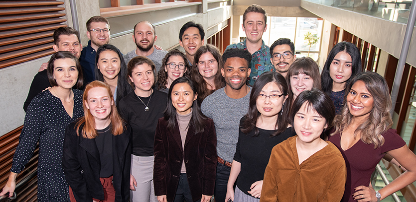
The graduating students in the Master of Science in Engineering Design Innovation (EDI) program at Northwestern University have reached the end of an important journey.
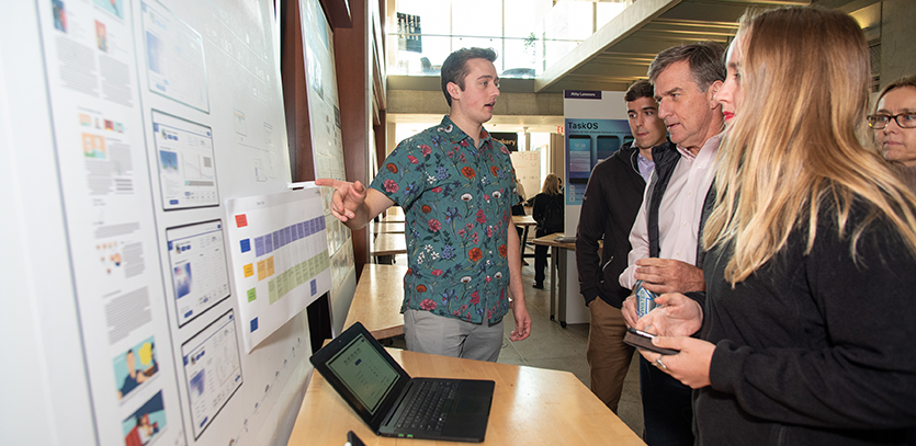
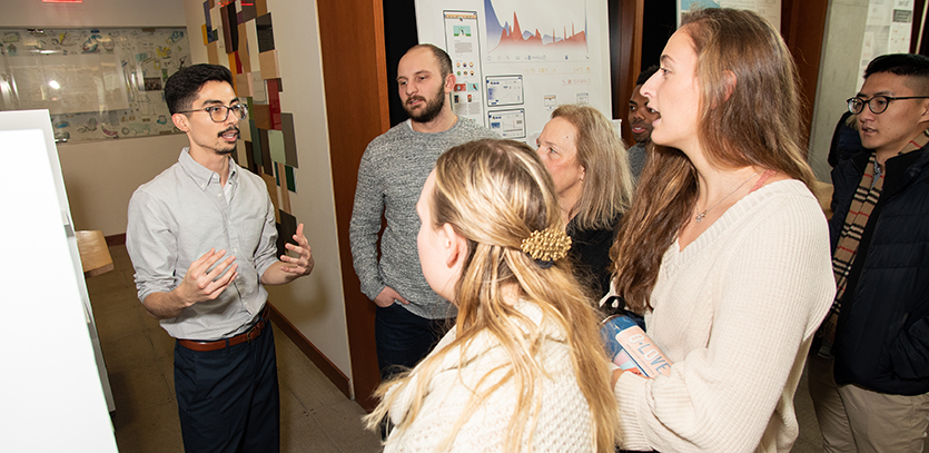
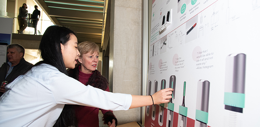
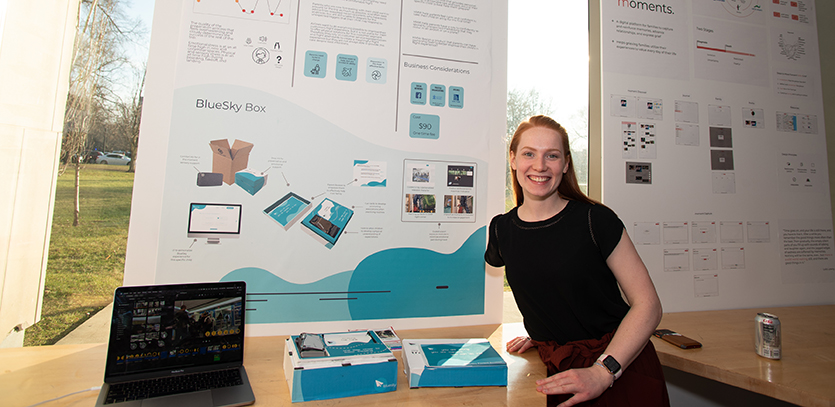
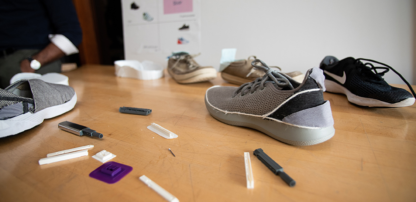
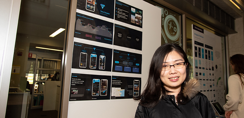
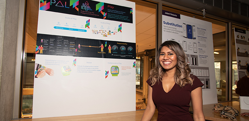
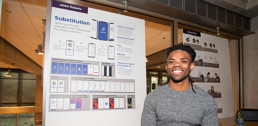
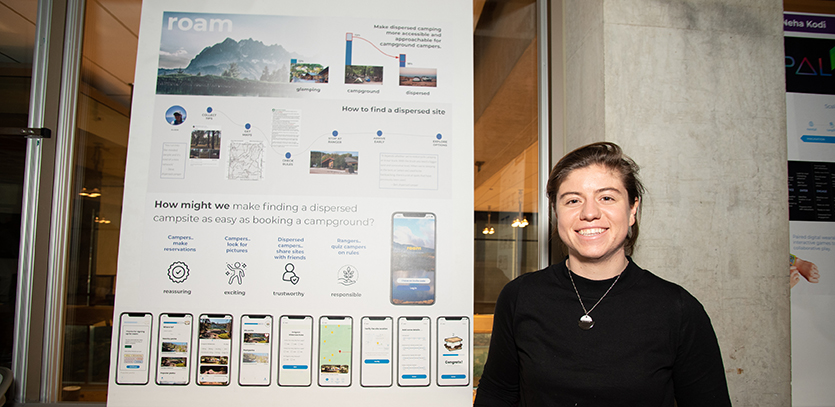
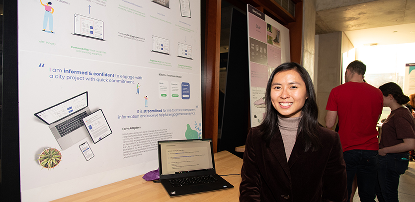
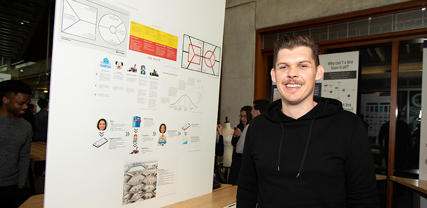
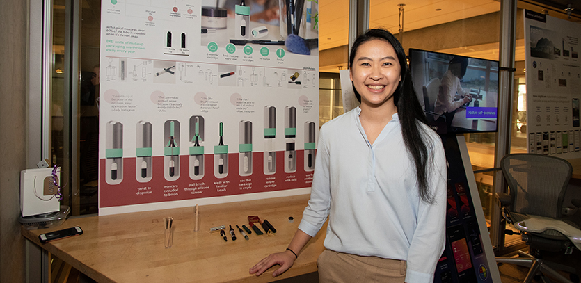
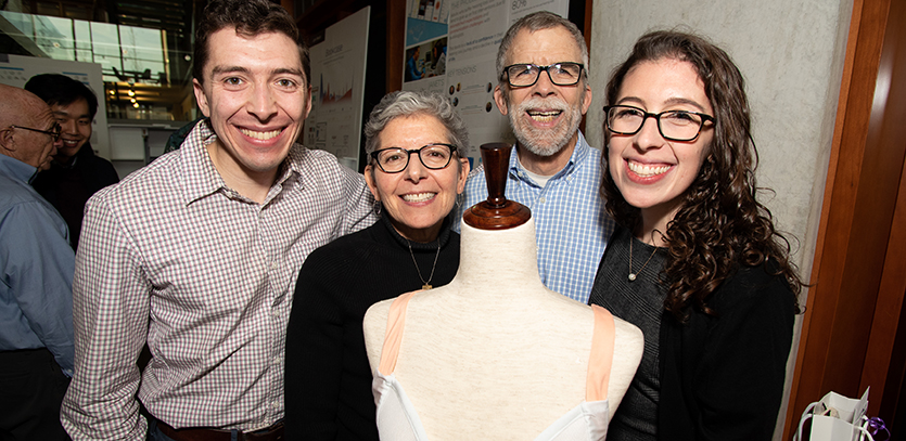
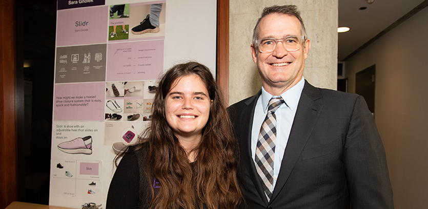
At the EDI Thesis Fair on December 13, the students showcased their thesis projects before faculty, mentors, family, friends, and classmates at the Ford Motor Company Engineering Design Center. The culmination of a 15-month academic journey, the students' self-selected projects demonstrate their growth as "T-Shaped" designers – professionals who blend their engineering and technical skills with the human-centered design process to produce considerate, accessible solutions.
“With these thesis projects, students define an area they're passionate about and solve a problem in a way that is realistic and mindful,” EDI Program director Jim Wicks says.
Students began their respective thesis endeavors last spring, identifying a specific problem or question before conducting qualitative and quantitative research to better understand the issue at hand. While students reviewed academic research and analyzed current on-the-market solutions, much effort was devoted to understanding the human condition. Through interviews, direct observation, and field research, students detected pain points and themes as they moved toward designing rich, empathetic solutions, whether that was a physical product, a digital solution, or a service.
As students entered the fall term, they progressed from research to design, embracing an iterative process of testing and adjusting their ideas based on user feedback, observations, and the support of faculty and EDI peers as well as mentors – current design practitioners whose perspective, insights, and experience prove invaluable to students’ developing work and the hurdles they inevitably encounter.
In her second year as a mentor, Susan Curtis, founder and president of Chicago-based experience design consultancy Bloompath Studios, worked with three EDI students. She enjoyed the hands-on, one-on-one experience of helping students develop a real-world solution much as they would as professional designers.
“The thing I'm always trying to emphasize with students is that their concept and strategies be driven by human insights,” Curtis says. "We're not making something to make something. We need to research and understand the user before carrying that into a design solution."
By pairing their academic or professional experience in areas such as engineering, computer science, or psychology with the EDI program's unwavering focus on human-centered design, Wicks says students graduate well-prepared to tackle real-world problems that impact human's everyday living and quality of life.
"It's that depth and breadth of design and problem solving that we want to promote in the EDI program," Wicks says. "As our graduates head into professional positions, whether that's in product management, service design, hardware, or at a design consultancy, we hope they leave here confident they can perform at a high level. They've grown and developed powerful skills around research, storytelling, quality, and have the ability to create thoughtful designs that impact human life."
Four projects from the 2019 EDI Thesis Fair
Here is a closer look at four projects from the 2018 EDI Thesis Fair.
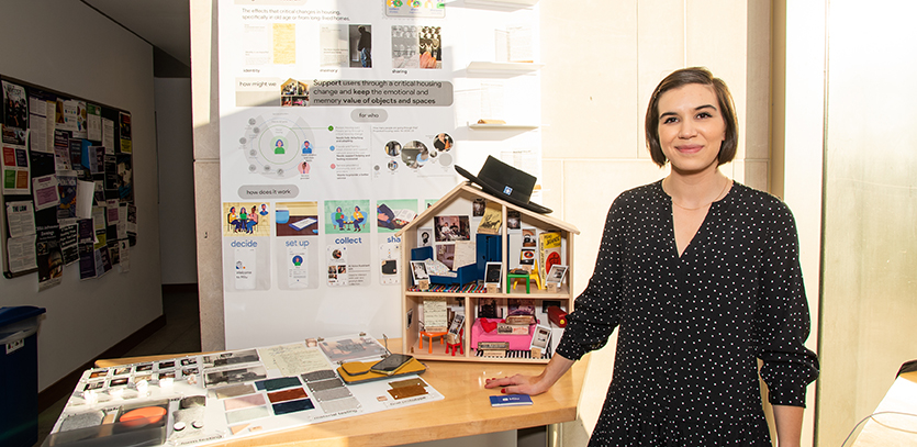
Milu by Bea Alessio
The Problem: When individuals move, clean out a house after a parent's passing, or otherwise leave a space they know well, they often face the difficult process of detaching from these memory-filled environments.
The Solution: An app and handheld device that facilitates memory collection and object sharing through Google’s voice-interaction API.
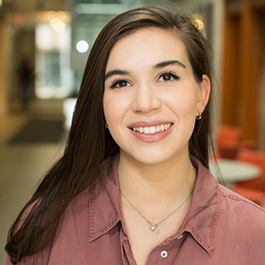 Building the Solution: Interviewing people who had to detach themselves from a treasured physical space, assisting people in the moving process, and visiting senior living facilities, Alessio found that spaces and objects carry strong memories and stories. After mapping the problem, she began developing prototypes to help people collect the value of their memories. With additional testing, specifically analyzing how efficient her solution was in facilitating this collection, she refined Milu, specifically leveraging materials and colors that sparked positive feelings.
"This project helped me see tech, especially AI, as a tool to improve people's lives. It required learning how to leverage feasible technology in a viable business model and pairing it with thoughtful design."
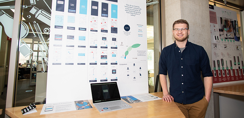
Bookcase by John Welch
The Problem: The child adoption process is often a passive endeavor that leaves adoptive parents feeling removed and powerless.
The Solution: A multi-layered digital platform that helps adoptive parents create their "book" – the tangible product sharing personal information and photos with biological parents – and then integrates data analytics so adoptive parents can update their profile.
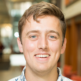 Building the Solution: Focusing on agency adoptions, Welch interviewed social workers, completed a class on the adoption system, and researched the birth parents’ process. He then prototyped and tested his ideas, paying close attention to the creation of a book's content, the sharing of personal information, the role of external perspectives, and the feelings of competitiveness among adoptive parents.
"I've really enjoyed getting to hear from real parents. It has felt like a super impactful project and something that could really help actual parents in the adoption process."
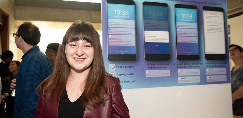
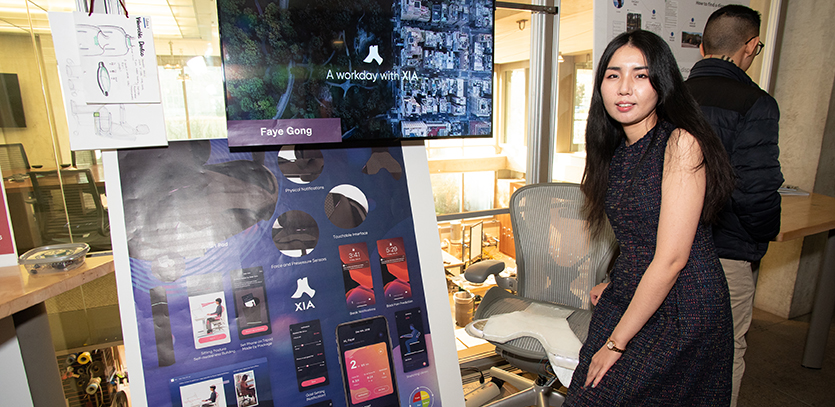
TaskOS by Abby Lammers
The Problem: Mobile notifications that one does not address immediately often get buried below incoming clutter.
The Solution: A reimagining of the iOS notification workflow that allows phone users to add notifications to a task queue, thereby isolating messages and providing users an accessible space to revisit key notifications.
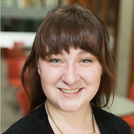 Building the Solution: Through interviews, Lammers examined how mobile phone users determined the urgency of their notifications. She uncovered that many people use their notifications as to-do lists. Exploring how to make that to-do list functionality more intentional, she decided that a separate queue for to-dos would be simple and consistent with current mental models of notifications. After sharing sketches with users and collecting feedback, her final solution included a list mirrored on both the notification screen and the reminders list.
"I’ve learned a lot from my own mistakes along the way, including a classic designer misstep: getting so caught up in the software and the craft that I forgot what questions I was trying to answer. In the future, I’ll be much more intentional about the prototypes I make and put in front of users."
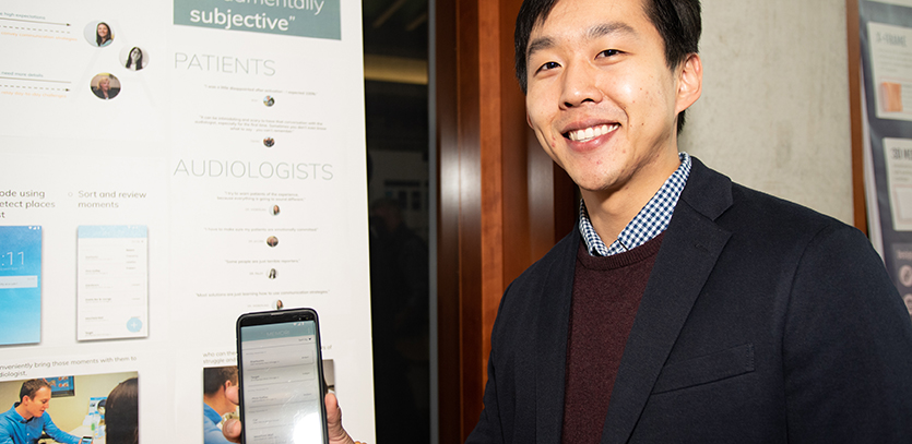
Memori by Haein Kim
The Problem: Young adults with hearing loss often struggle to adopt hearing aids due to mismatched expectations and a difficult, prolonged hearing loss journey.
The Solution: A mobile app designed to help first-time hearing aid users navigate their daily lives and enjoy a more constructive relationship with their audiologist.
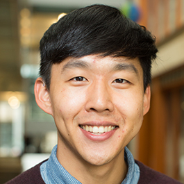 Building the Solution: Kim, who has been deaf for much of his life, started by exploring the hearing loss world, including capturing life stories from individuals with hearing loss. He mapped out the lifelong journey of hearing loss, identified overlaps in themes and common pain points, and conducted concept and user testing before designing a low-fidelity mobile app prototype. With additional user testing and feedback from both individuals experiencing hearing loss and audiologists, Kim further refined Memori.
"This project gave me more clarity on why it's so important to listen to your users and understand their struggles. It also gave me perspective on the need for more human-centered design, or patient-centered design, in health care."

